Assignment
Required Resources
Read/review the following resources for this activity:
- OpenStax Textbook: Chapter 2
- Lesson
- Chamberlain University Library
- Internet
- Week 3 Lab TemplateLinks to an external site.
Required Software
- Microsoft Word
- Internet access to read articles
Scenario/Summary
This week’s lab highlights the use of graphics, distributions, and tables to summarize and interpret data.
Instructions
Part 1:
- Your instructor will provide you with a scholarly article. The article will contain at least one graph and/or table. Please reach out to your instructor if you do not receive the article by Monday of Week 3.
Part 2:
- Title your paper: “Review of [Name of Article]”
- State the Author:
- Summarize the article in one paragraph:
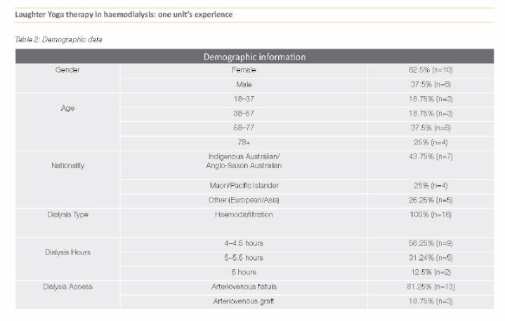
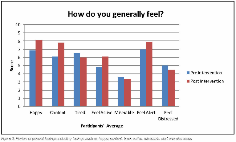
- Post a screenshot of the article’s frequency table and/or graph.
Example:
Frequency Distribution -OR- Graph

- Answer the following questions about your table or graph.
- What type of data does the graph, chart, or table from your screenshot above display (Quantitative or Qualitative data)?
- Explain how you came to that conclusion.
- What type of graph, table, or chart did you choose from your screenshot above display (bar graph, histogram, stem & leaf plot, etc.)?
- What characteristics make it this type (you should bring in material that you learned in the course)?
- Describe the data displayed in your graph, table, or chart from your screenshot above. What is the graph displaying in the context of the article?
- Draw a conclusion about the data from the graph, table, or chart from your screenshot above in the context of the article. Make an inference based on the data displayed.
- How else might this data have been displayed?
- Pick two alternate graphs/charts/tables that could be used to display the same data as your selected chart/graph/table from your screenshot above. List the pros and cons of these alternative graphs.
- Explain how the graphs/charts/tables that you selected above (Part E) would be structured to display the data in the article.
- What type of data does the graph, chart, or table from your screenshot above display (Quantitative or Qualitative data)?
- Give the full APA reference of the article you are using for this lab.
- Be sure your name is on the Word document, save it, and then submit it under “Assignments” and “Week 3: Lab”.
Requirements
The deliverable is a Word document with your answers to the questions posed above based on the article you were assigned.
Grading
This activity will be graded based on the Week 3 Lab Rubric.
Outcomes
CO 1: Given scenarios supported by population data, apply sampling techniques and explain potential pitfalls and bias in data collection.
CO 2: Given datasets with qualitative and quantitative data, differentiate between the types of data and how they can be applied in statistical studies for everyday life.
Due Date
By 11:59 p.m. MT on Sunday
Rubric
Week 3: Lab
| Criteria | Ratings | Pts | |||||
|---|---|---|---|---|---|---|---|
This criterion is linked to a Learning OutcomeThis criterion is linked to a Learning Outcome Summarizing an article. |
| 12 pts | |||||
This criterion is linked to a Learning OutcomeThis criterion is linked to a Learning Outcome Frequency Distribution/Graphs |
| 15 pts | |||||
This criterion is linked to a Learning OutcomeThis criterion is linked to a Learning Outcome: Pros, Cons, and construction of alternative displays |
| 15 pts | |||||
This criterion is linked to a Learning OutcomeThis criterion is linked to a Learning Outcome Grammar and Formatting |
| 8 pts | |||||
Total Points: 50 | |||||||
